3 Data visualisation
3.2.4 Exercises
Run
ggplot(data = mpg). What do you see?ggplot(data = mpg)
empty graph, because we don’t set the aesthetic mapping for plot.
How many rows are in
mpg? How many columns?dim(mpg) ## [1] 234 11rows: 234, columns: 11
What does the
drvvariable describe? Read the help for?mpgto find out.?mpgdrv: f = front-wheel drive, r = rear wheel drive, 4 = 4wd
Make a scatterplot of
hwyvscyl.ggplot(mpg) + geom_point(aes(x = hwy, y = cyl))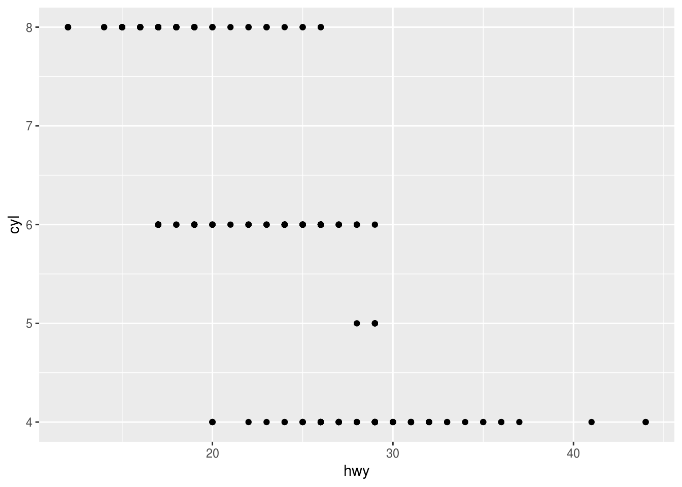
What happens if you make a scatterplot of
classvsdrv? Why is the plot not useful?ggplot(mpg) + geom_point(aes(class, drv))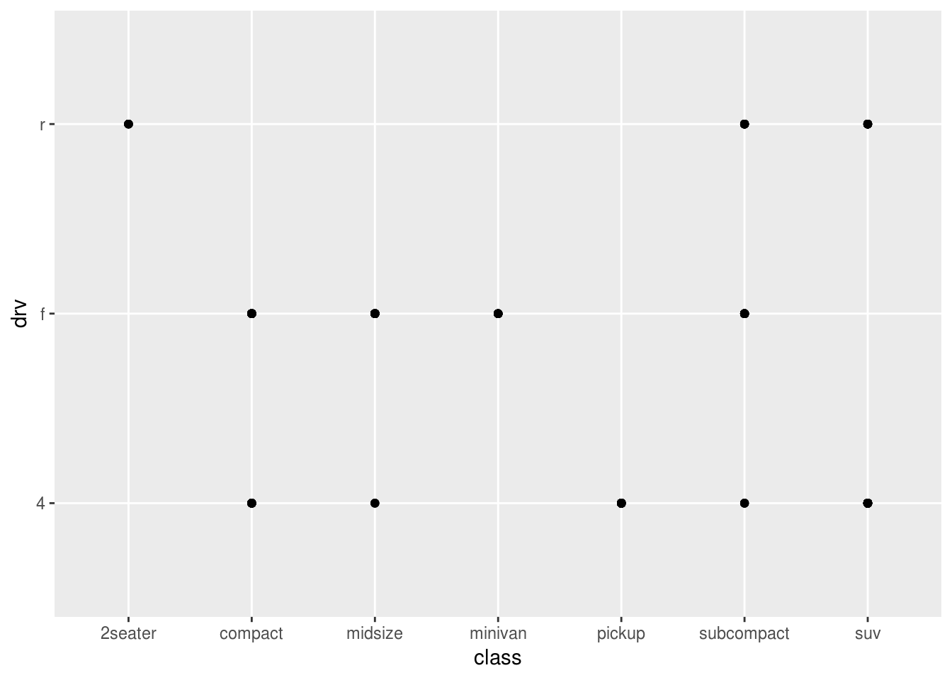
3.3.1 Exercises
What’s gone wrong with this code? Why are the points not blue?
   ggplot(data = mpg) +
geom_point(mapping = aes(x = displ, y = hwy, color = "blue"))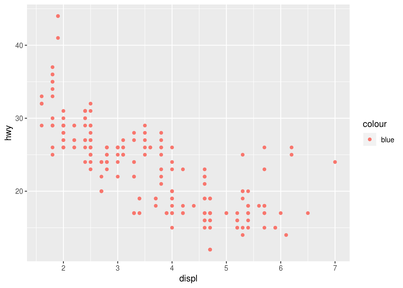
Need to put color attribute outside the aes()
Because the color argument was set within aes(), not geom_point()Which variables in
mpgare categorical? Which variables are continuous? (Hint: type?mpgto read the documentation for the dataset). How can you see this information when you runmpg?str(mpg) ## Classes 'tbl_df', 'tbl' and 'data.frame': 234 obs. of 11 variables: ## $ manufacturer: chr "audi" "audi" "audi" "audi" ... ## $ model : chr "a4" "a4" "a4" "a4" ... ## $ displ : num 1.8 1.8 2 2 2.8 2.8 3.1 1.8 1.8 2 ... ## $ year : int 1999 1999 2008 2008 1999 1999 2008 1999 1999 2008 ... ## $ cyl : int 4 4 4 4 6 6 6 4 4 4 ... ## $ trans : chr "auto(l5)" "manual(m5)" "manual(m6)" "auto(av)" ... ## $ drv : chr "f" "f" "f" "f" ... ## $ cty : int 18 21 20 21 16 18 18 18 16 20 ... ## $ hwy : int 29 29 31 30 26 26 27 26 25 28 ... ## $ fl : chr "p" "p" "p" "p" ... ## $ class : chr "compact" "compact" "compact" "compact" ...Categorical: manufacturer, model, trans, drv, fl, class
Continuous: displ, cyl, cty, hwyMap a continuous variable to
color,size, andshape. How do these aesthetics behave differently for categorical vs. continuous variables?color:
   ggplot(mpg) +
 geom_point(aes(displ, hwy, color = cty))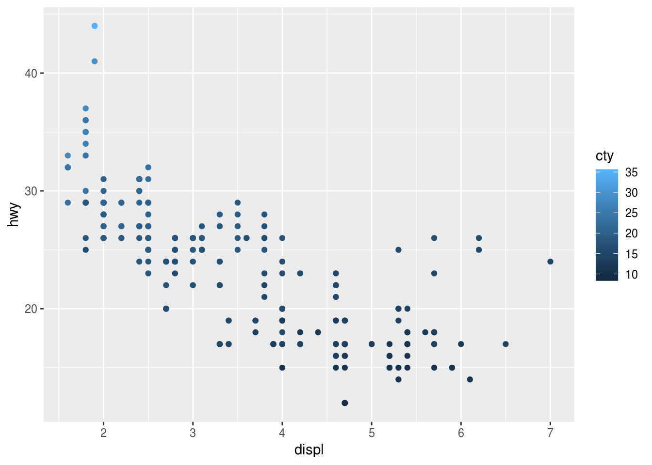
shape:
   ggplot(mpg) +
 geom_point(aes(displ, hwy, shape = cty))
## Error: A continuous variable can not be mapped to shape
size:
   ggplot(mpg) +
 geom_point(aes(displ, hwy, size = cty))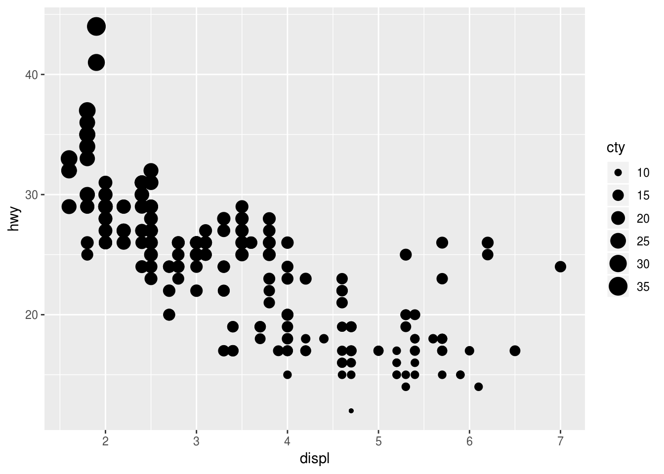
What happens if you map the same variable to multiple aesthetics?
   ggplot(mpg) +
 geom_point(aes(displ, hwy, color = manufacturer, size = manufacturer))
## Warning: Using size for a discrete variable is not advised.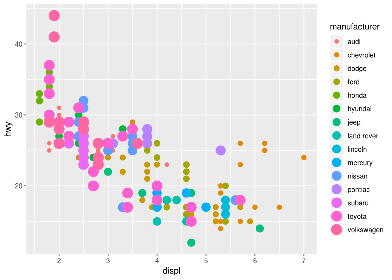
What does the
strokeaesthetic do? What shapes does it work with? (Hint: use?geom_point)To modify the width of the border
   ggplot(mpg) +
 geom_point(aes(displ, hwy, color = class, stroke = 5))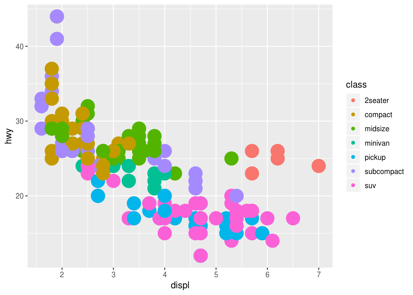
What happens if you map an aesthetic to something other than a variable name, like
aes(colour = displ < 5)? Note, you’ll also need to specify x and y.ggplot(mpg) + geom_point(aes(displ, hwy, color = displ < 5))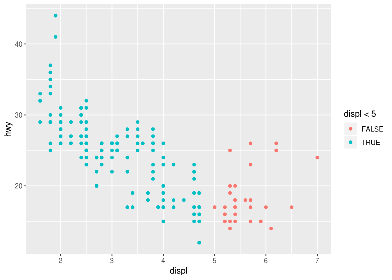
3.5.1 Exercises
What happens if you facet on a continuous variable?
   ggplot(data = mpg) +
 geom_point(mapping = aes(x = drv, y = cyl)) +
 facet_wrap(~ displ)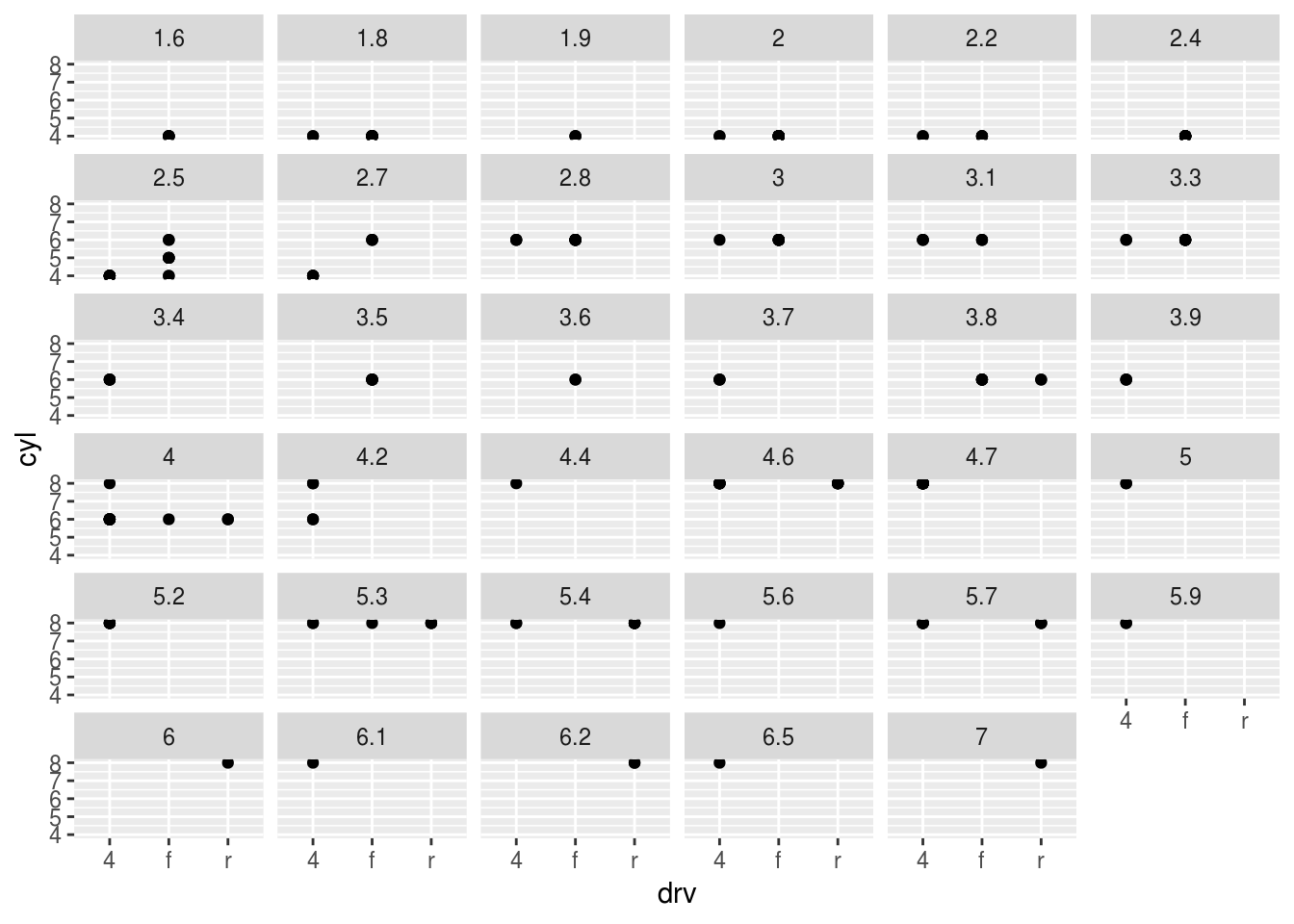
Your graph will not make much sense. R will try to draw a separate facet for each unique value of the continuous variable. If you have too many unique values, you may crash R.
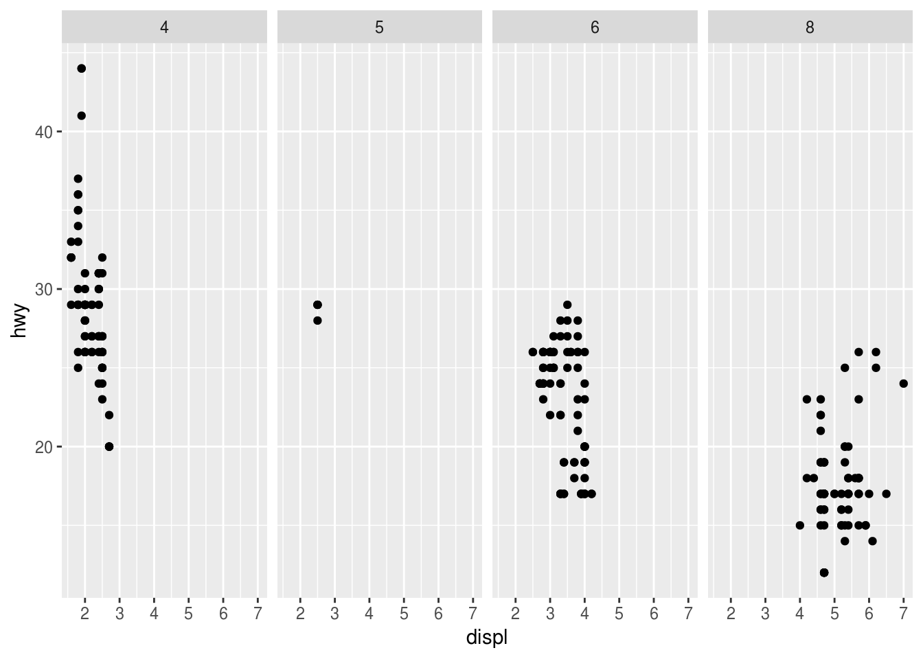
What do the empty cells in plot with
facet_grid(drv ~ cyl)mean? How do they relate to this plot?ggplot(data = mpg) + geom_point(mapping = aes(x = drv, y = cyl))ggplot(data = mpg) + geom_point(mapping = aes(x = drv, y = cyl)) + facet_grid(drv ~ cyl)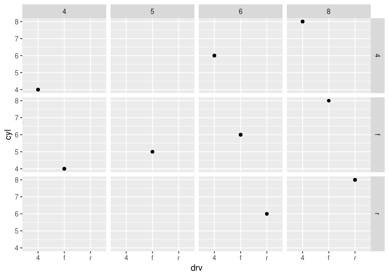
   ggplot(data = mpg) +
 geom_point(mapping = aes(x = drv, y = cyl, color = drv))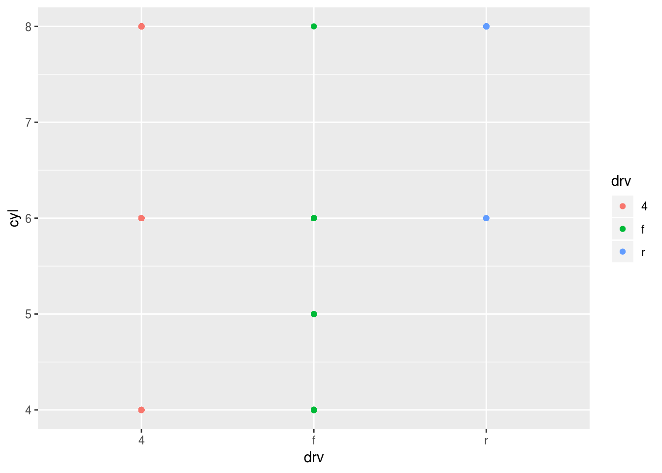
empty cells mean that there are no relation between drv and cyl. no 4 cylinders with rear wheel drive
What plots does the following code make? What does . do?
   ggplot(data = mpg) +
 geom_point(mapping = aes(x = displ, y = hwy)) +
 facet_grid(drv ~ .)

   ggplot(data = mpg) +
 geom_point(mapping = aes(x = displ, y = hwy)) +
facet_grid(. ~ cyl)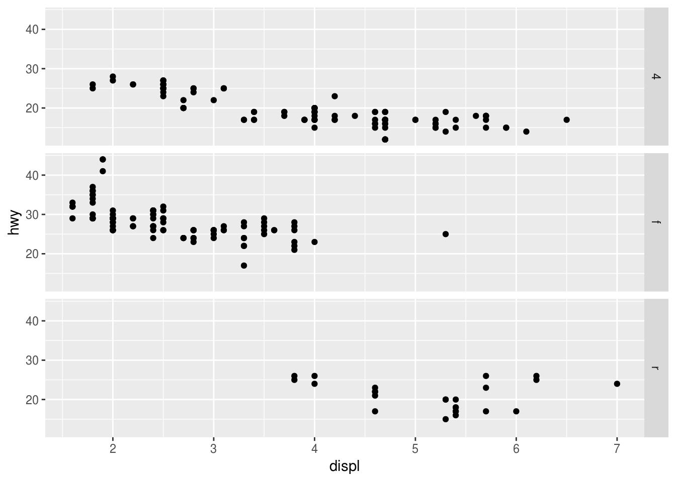
Display the plot on the horizontal and/or vertical direction . acts a placeholder for no variable
Take the first faceted plot in this section:
ggplot(data = mpg) +
  geom_point(mapping = aes(x = displ, y = hwy)) +
  facet_wrap(~ class, nrow = 2)
What are the advantages to using faceting instead of the colour aesthetic?
Faceting splits the data into separate grids and better visualizes trends within each individual facet.
What are the disadvantages?
disadvantage is that by doing so, it is harder to visualize the overall relationship across facets.
How might the balance change if you had a larger dataset?
The color aesthetic is fine when your dataset is small, but with larger datasets points may begin to overlap with one another. In this situation with a colored plot, jittering may not be sufficient because of the additional color aesthetic.
Read
?facet_wrap. What doesnrowdo? What doesncoldo?nrow and ncol will show the row numbers and column numbers in the split plot
What other options control the layout of the individual panels?
as.table determines the starting facet to begin filling the plot, and dir determines the starting direction for filling in the plot (horizontal or vertical).
Why doesn’t
facet_grid()havenrowandncolarguments?
When using
facet_grid()you should usually put the variable with more unique levels in the columns. Why?This will extend the plot vertically, where you typically have more viewing space. If you extend it horizontally, the plot will be compressed and harder to view.
3.6.1 Exercises
What geom would you use to draw a line chart? A boxplot? A histogram? An area chart?
line chart -> geom_line() boxplot -> geom_boxplot() histrogram -> geom_histogram() area chart -> geom_area()
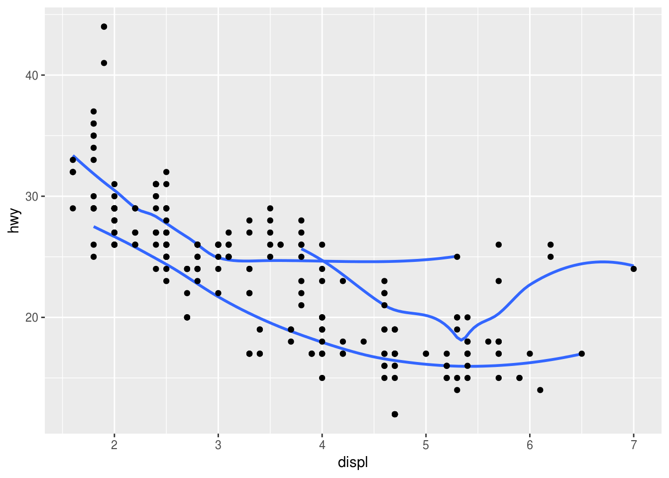
Run this code in your head and predict what the output will look like. Then, run the code in R and check your predictions.
ggplot(data = mpg, mapping = aes(x = displ, y = hwy, color = drv)) +
  geom_point() +
  geom_smooth(se = FALSE)
What does show.legend = FALSE do? What happens if you remove it? Why do you think I used it earlier in the chapter?
show.legend = FALSE, it will set the legend graph unable to see. If remove it, then the plot will show the legend
What does the se argument to geom_smooth() do?
Display confidence interval around smooth.
Will these two graphs look different? Why/why not?
ggplot(data = mpg, mapping = aes(x = displ, y = hwy)) +
  geom_point() +
  geom_smooth()

ggplot() +
  geom_point(data = mpg, mapping = aes(x = displ, y = hwy)) +
  geom_smooth(data = mpg, mapping = aes(x = displ, y = hwy))
No, because they use the same data and mapping settings. The only difference is that by storing it in the ggplot() function, it is automatically reused for each layer.
Recreate the R code necessary to generate the following graphs.


### (1)
ggplot(data = mpg, mapping = aes(x = displ,  y = hwy)) +
  geom_point() +
  geom_smooth(se = FALSE)
## `geom_smooth()` using method = 'loess' and formula 'y ~ x'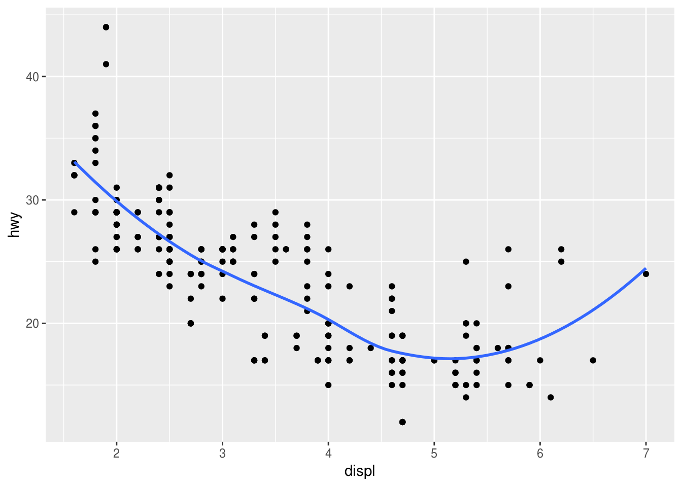
### (2)
ggplot(data = mpg, mapping = aes(x = displ, y = hwy)) +
  geom_point() +
  geom_smooth(mapping = aes(group = drv), se = FALSE)
## `geom_smooth()` using method = 'loess' and formula 'y ~ x'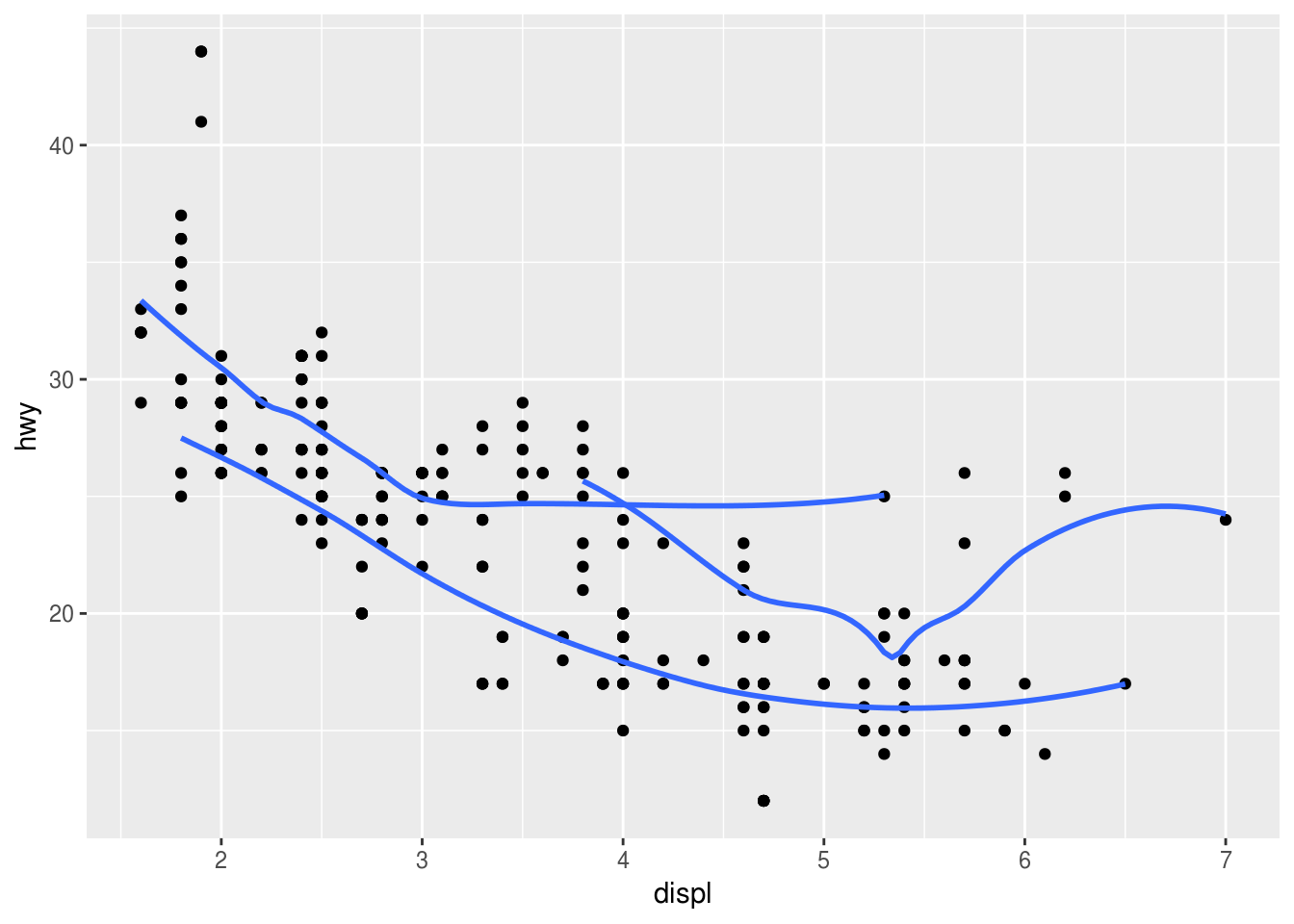
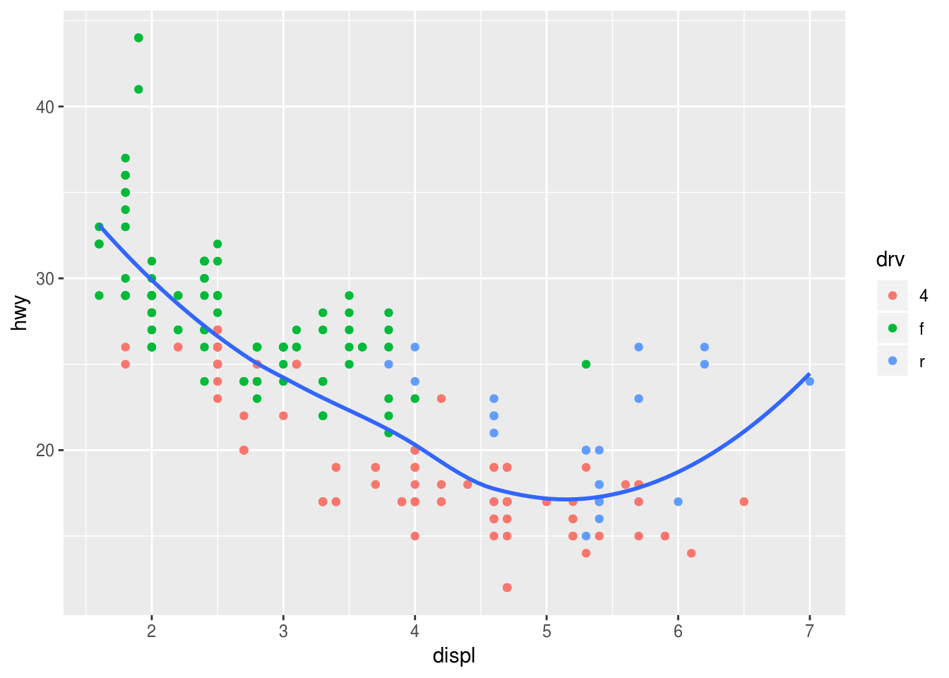
### (3)
ggplot(data = mpg, mapping = aes(x = displ, y = hwy, color = drv)) +
  geom_point() +
  geom_smooth(se = FALSE)
## `geom_smooth()` using method = 'loess' and formula 'y ~ x'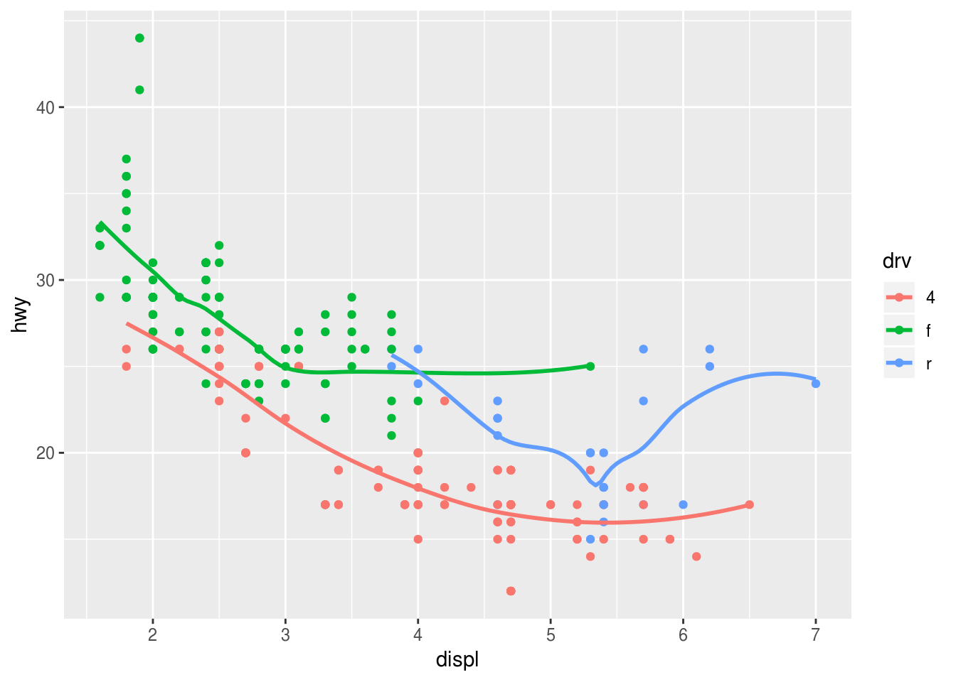
### (4)
ggplot(data = mpg, mapping = aes(x = displ, y = hwy)) +
  geom_point(mapping = aes(color = drv)) +
  geom_smooth(se = FALSE)
## `geom_smooth()` using method = 'loess' and formula 'y ~ x'
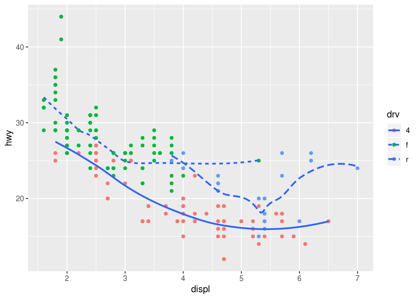
  ### (5)
  ggplot(data = mpg, mapping = aes(x = displ, y = hwy)) +
    geom_point(mapping = aes(color = drv)) +
    geom_smooth(mapping = aes(linetype = drv), se = FALSE)
## `geom_smooth()` using method = 'loess' and formula 'y ~ x'
  ### (6)
  ggplot(data = mpg, mapping = aes(x = displ, y = hwy)) +
    geom_point(color = 'white', size =4) +
    geom_point(mapping = aes(color = drv))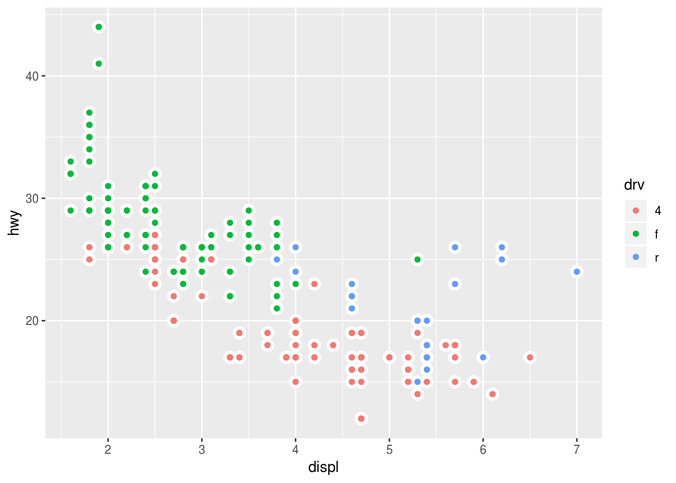
3.7.1 Exercises
What is the default geom associated with
stat_summary()? How could you rewrite the previous plot to use that geom function instead of the stat function?Use “?stat_summary()”, you’ll find the poperty of default geom is geom_pointrange()
ggplot(data = diamonds) +
    geom_pointrange (
    mapping = aes(x = cut, y = depth),
    stat = 'summary',
    fun.ymin = min,
    fun.ymax = max,
    fun.y = median
    )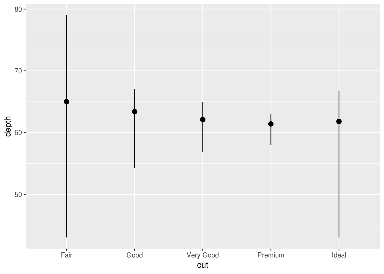
What does
geom_col()do? How is it different togeom_bar()?There are two types of bar charts: geom_bar() and geom_col(). geom_bar() makes the height of the bar proportional to the number of cases in each group (or if the weight aesthetic is supplied, the sum of the weights). If you want the heights of the bars to represent values in the data, use geom_col() instead. geom_bar() uses stat_count() by default: it counts the number of cases at each x position.
Most geoms and stats come in pairs that are almost always used in concert. Read through the documentation and make a list of all the pairs. What do they have in common?
What variables does
stat_smooth()compute? What parameters control its behaviour?by ‘?stat_smooth’ -> find computed variables
- y: predicted value
- ymin: lower pointwise confidence interval around the mean
- ymax: upper pointwise confidence interval around the mean
- se: standard errorS
In our proportion bar chart, we need to set
group = 1. Why? In other words what is the problem with these two graphs?ggplot(data = diamonds) + geom_bar(mapping = aes(x = cut, y = ..prop..)) ggplot(data = diamonds) + geom_bar(mapping = aes(x = cut, fill = color, y = ..prop..))If we fail to set group = 1, the proportions for each cut are calculated using the complete dataset, rather than each subset of cut.
ggplot(data = diamonds) +
  geom_bar(mapping = aes(x = cut, y = ..prop.., group = 1))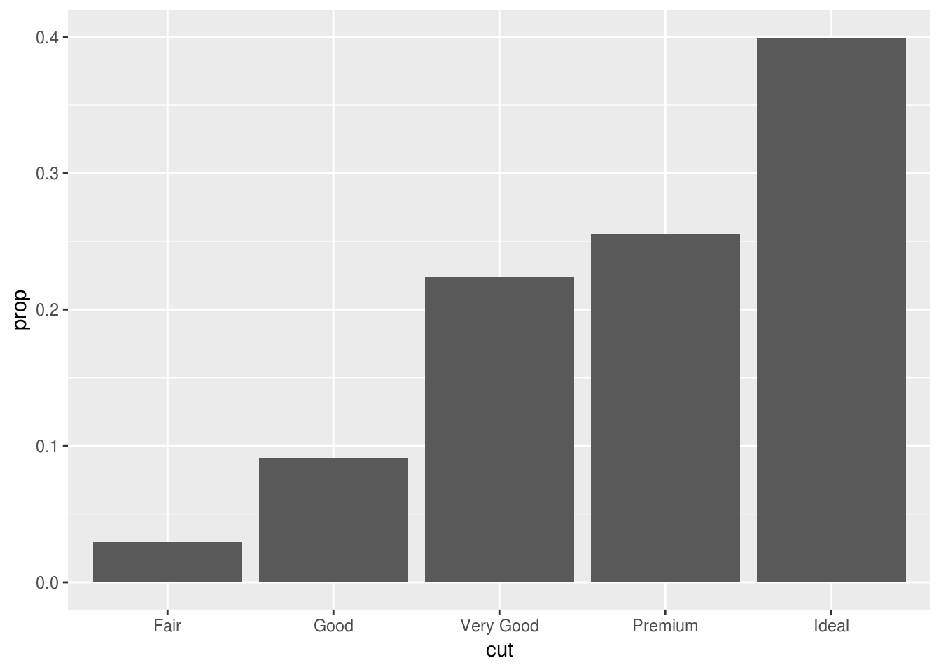
ggplot(data = diamonds) +
  geom_bar(mapping = aes(x = cut, fill = color, y = ..prop.., group = 1))
3.8.1 Exercises
What is the problem with this plot? How could you improve it?
ggplot(data = mpg, mapping = aes(x = cty, y = hwy)) +
  geom_point()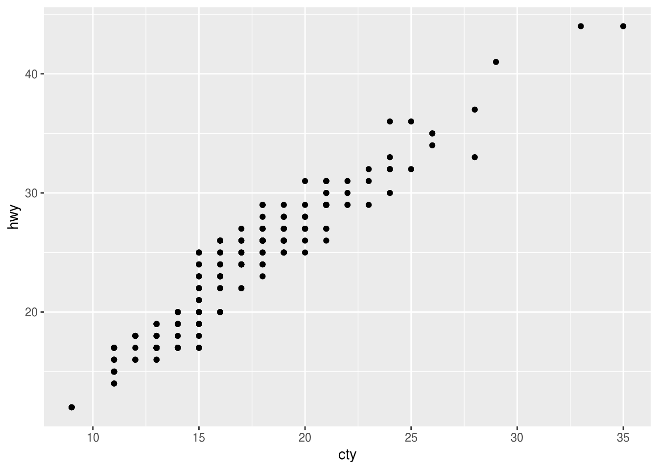
Many of the data points overlap
ggplot(data = mpg, mapping = aes(x = cty, y = hwy)) +
  geom_point(position = 'jitter')
ggplot(data = mpg, mapping = aes(x = cty, y = hwy)) +
  geom_jitter()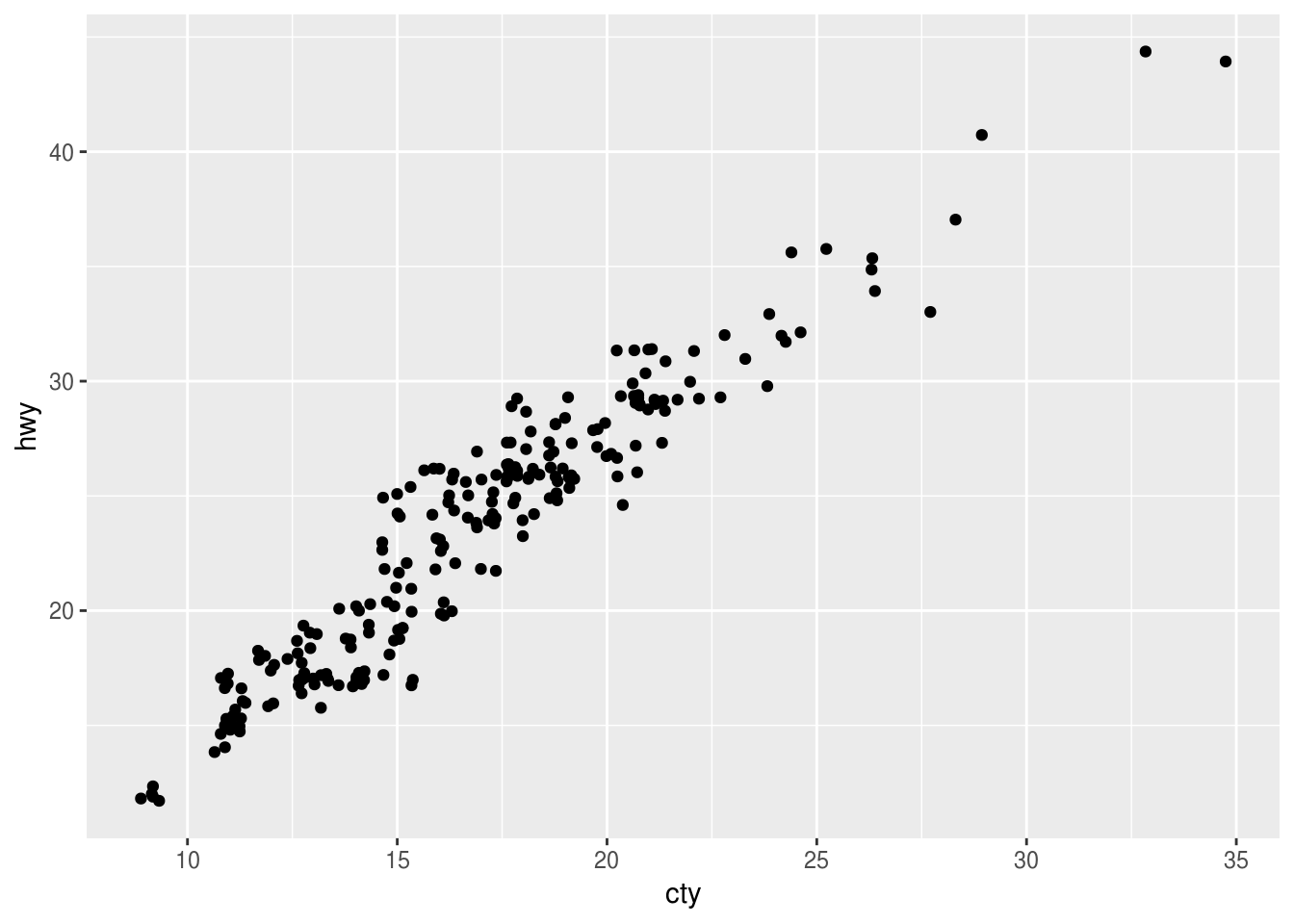
What parameters to
geom_jitter()control the amount of jittering?width and height
Compare and contrast
geom_jitter()withgeom_count().ggplot(data = mpg, mapping = aes(x = cty, y = hwy)) + geom_jitter()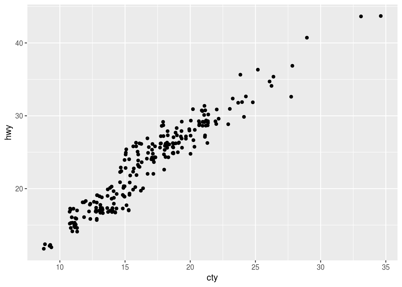
ggplot(data = mpg, mapping = aes(x = cty, y = hwy)) + geom_count()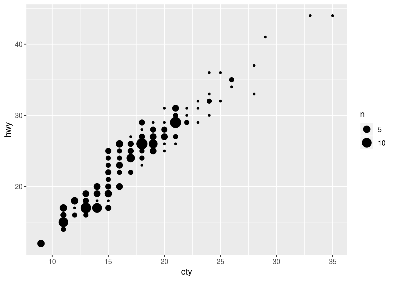 > This is a variant geom_point() that counts the number of observations at each location,
then maps the count to point area. It useful when you have discrete data and overplotting.
> This is a variant geom_point() that counts the number of observations at each location,
then maps the count to point area. It useful when you have discrete data and overplotting.What’s the default position adjustment for
geom_boxplot()? Create a visualisation of thempgdataset that demonstrates it.?geom_boxplot The default position is ‘dodge2’
ggplot(data = mpg, mapping = aes(x = class, y = hwy, color = drv)) +
  geom_boxplot()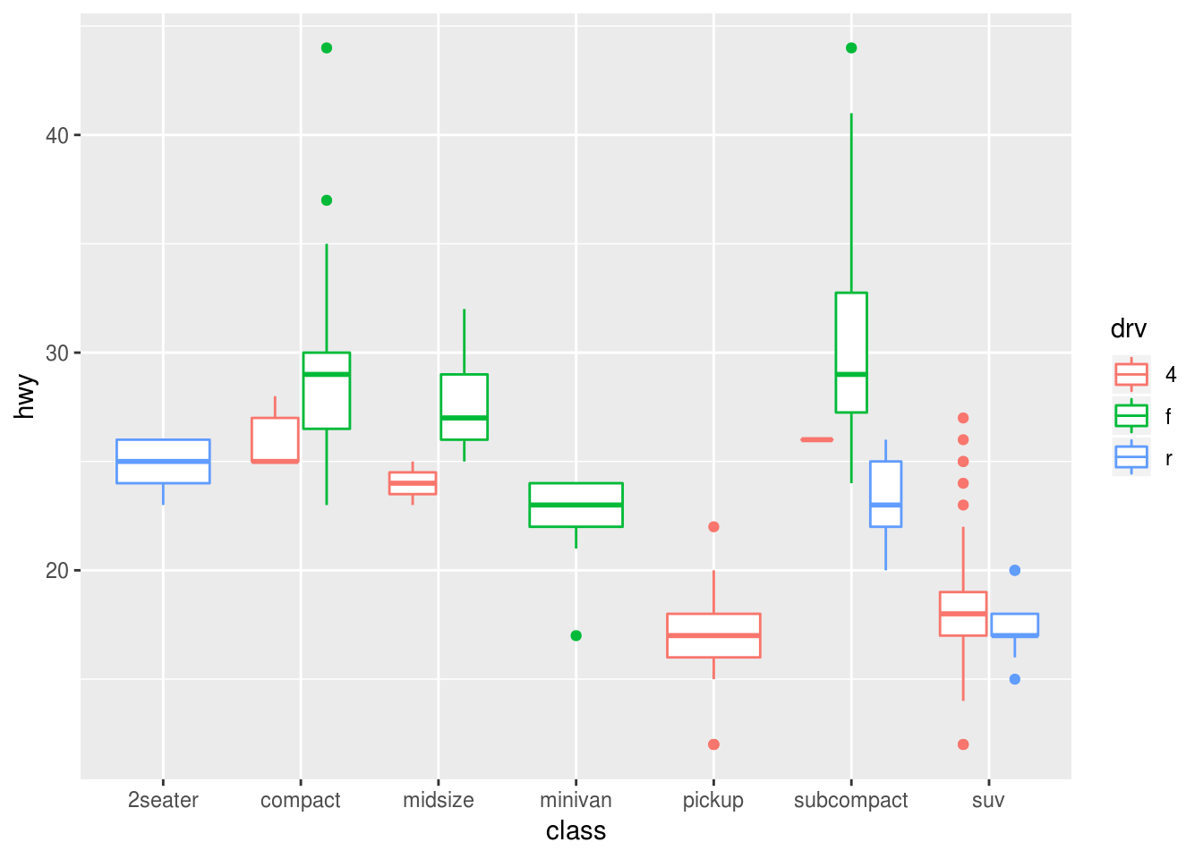
ggplot(data = mpg, mapping = aes(x = manufacturer, y = hwy, color = manufacturer)) +
  geom_boxplot()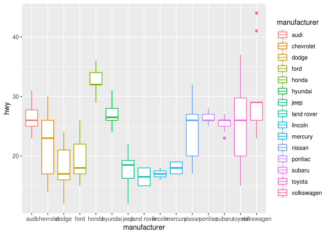
3.9.1 Exercises
Turn a stacked bar chart into a pie chart using
coord_polar().ggplot(data = mpg) + geom_bar(mapping = aes(x = class, y = stat(count), fill = model)) + coord_polar()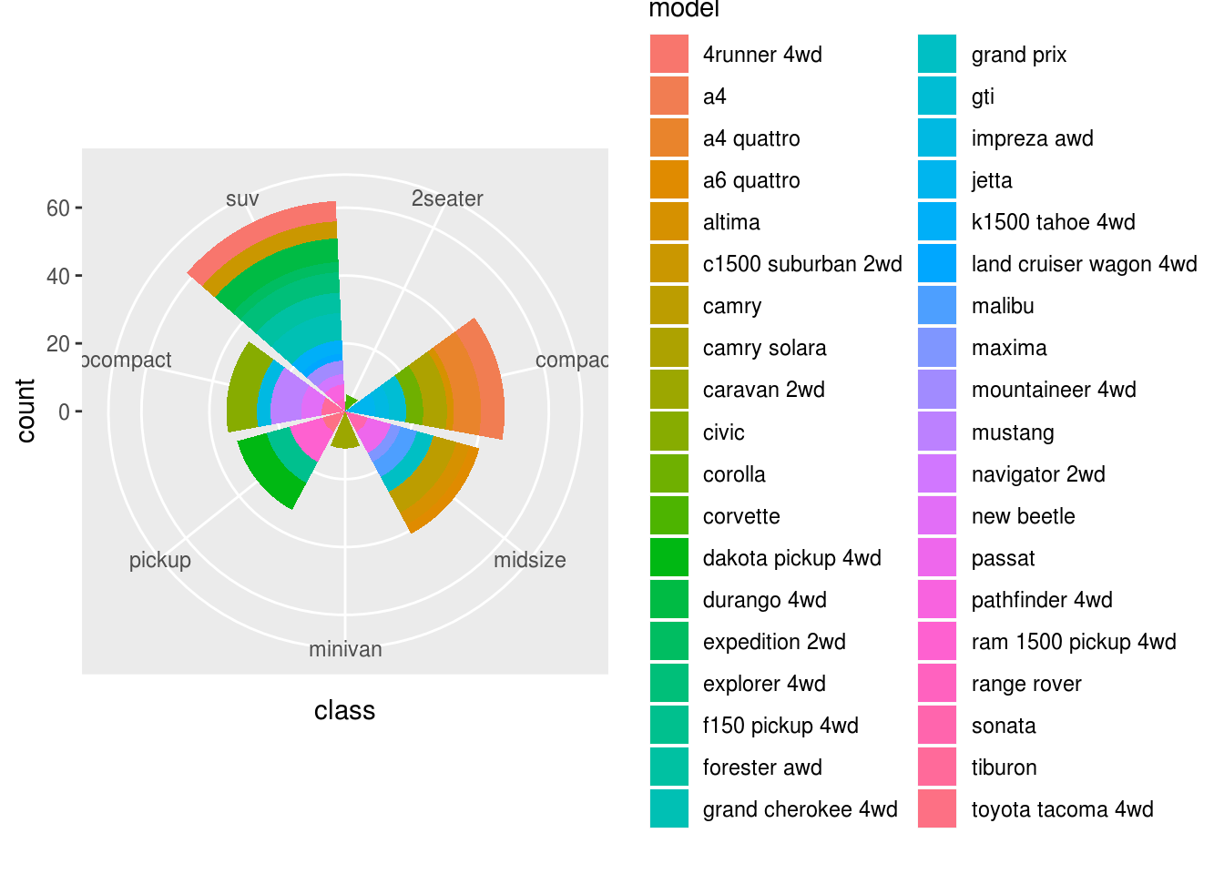
ggplot(data = mpg, mapping = aes(x = factor(1), fill = class)) +
  geom_bar(width = 1) +
  coord_polar(theta = "y")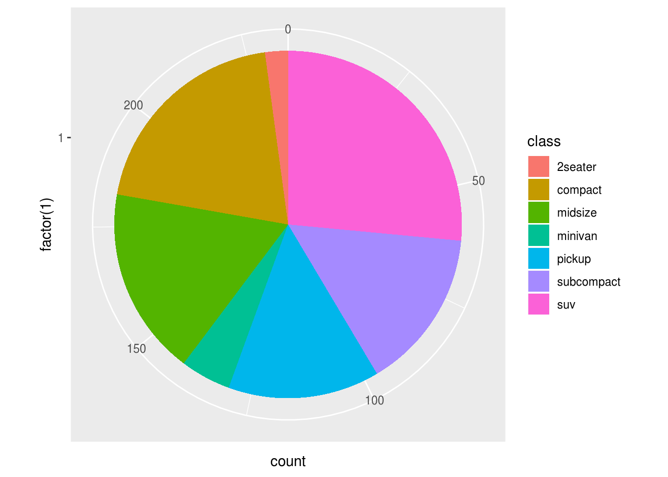
What does
labs()do? Read the documentation.?labs()adds labels to the graph. You can add a title, subtitle, and a label for the xand y axes, as well as a caption.
What’s the difference between
coord_quickmap()andcoord_map()??coord_map ?coord_quickmapcoord_map projects a portion of the earth, which is approximately spherical, onto a flat 2D plane using any projection defined by the mapproj package. Map projections do not, in general, preserve straight lines, so this requires considerable computation. coord_quickmap is a quick approximation that does preserve straight lines. It works best for smaller areas closer to the equator.
What does the plot below tell you about the relationship between city and highway mpg? Why is
coord_fixed()important? What doesgeom_abline()do?ggplot(data = mpg, mapping = aes(x = cty, y = hwy)) + geom_point() + geom_abline() + coord_fixed()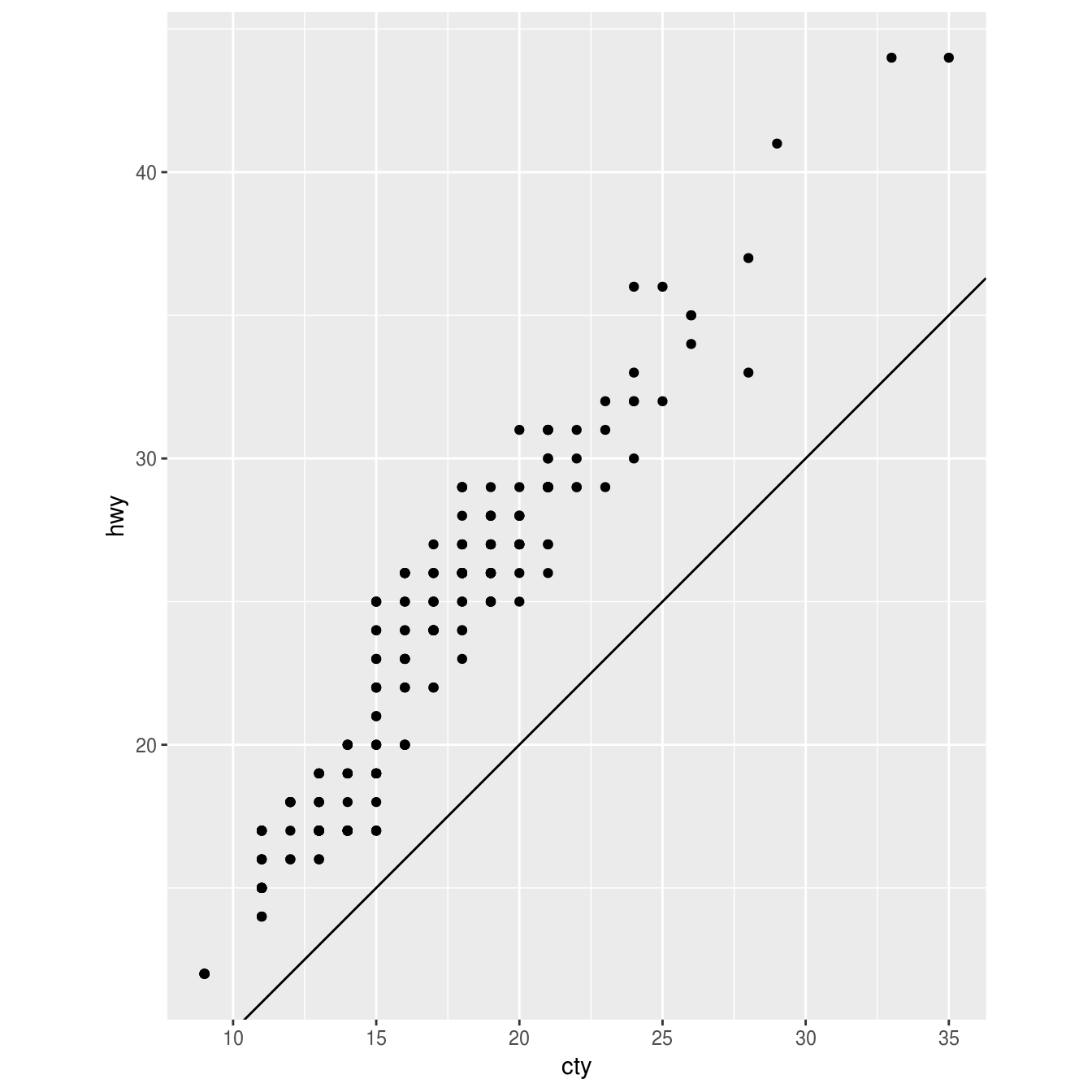
?coord_fixed
?geom_abline
The relationships is approximately linear, though overall cars have slightly better highway mileage than city mileage. But using coord_fixed(), the plot draws equal intervals on the x and y axes so they are directly comparable. geom_abline() draws a line that, by default, has an intercept of 0 and slope of 1. This aids us in our discovery that automobile gas efficiency is on average slightly higher for highways than city driving, though the slope of the relationship